RADIANT REVEL
A skincare identity that rejected 20-step routines and built an entire brand around just three products.
CLIENT
Radiant Revel
INDUSTRY
Skincare
LOCATION
USA
SERVICES
Positioning, Tone of Voice, Messaging Tone, Logo System, Colour Palette, Typography System, Icons, Packaging
Radiant Revel was built around a clear belief: skincare does not need to be a 20-product performance. While the industry keeps adding more serums, boosters, oils, routines, claims, and gendered product lines, Radiant Revel reduces skincare to three essentials — cleanse, nourish, and protect.
The strategy was simple: if the brand challenges the market, it cannot look like the market. So the identity moved away from soft beauty clichés, centred logos, floral cues, gendered colours, and cluttered scientific packaging.
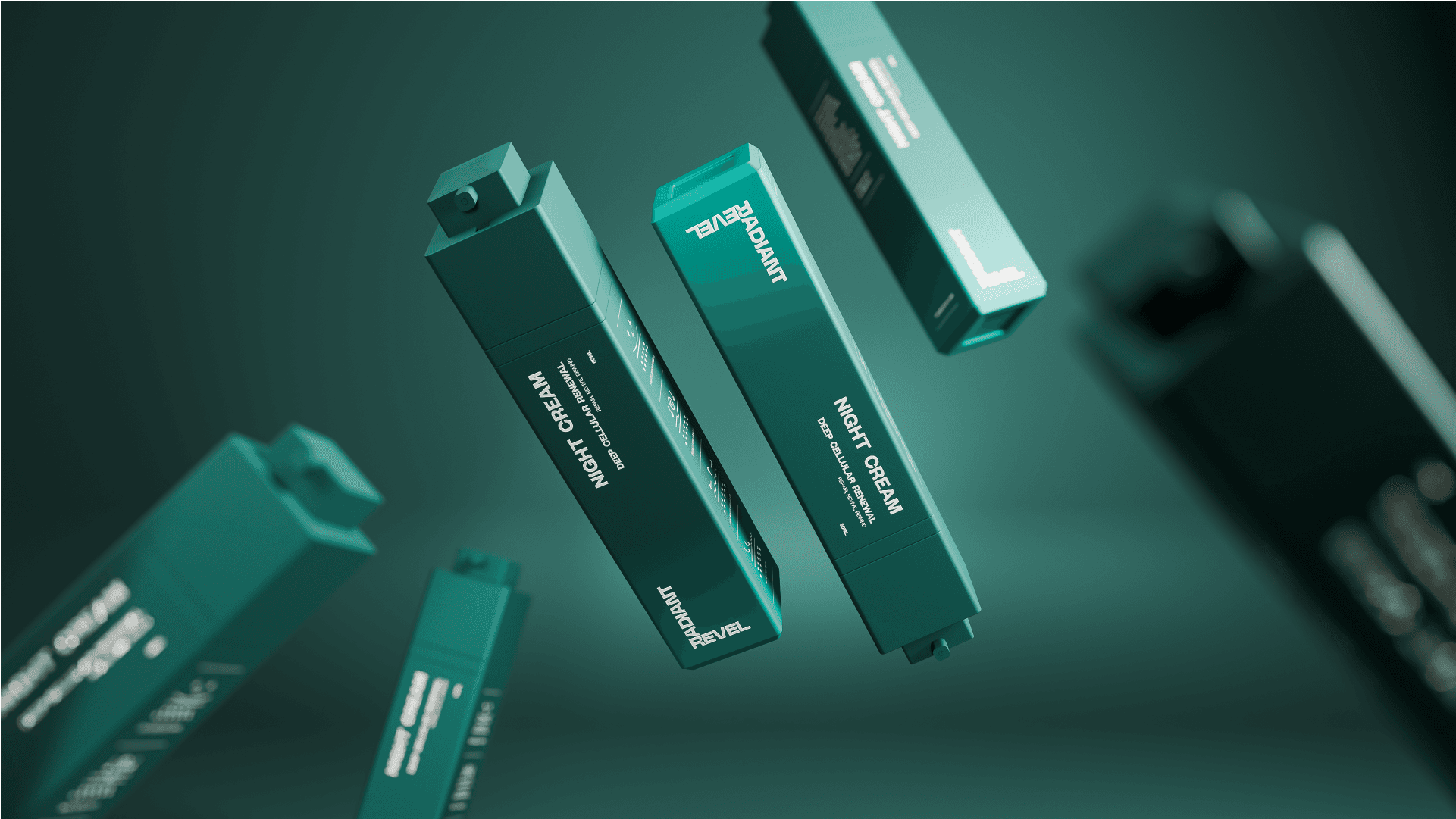
The logo is constructed from two rectangular forms joined at a right angle, creating a mark that naturally belongs in the corner of a layout. This corner placement became the brand’s visual signature — grounded, structural, and intentionally different from the centre-aligned behaviour common in skincare.
The same construction logic shaped the wider identity system. Icons were built with geometric forms, blunt edges, and controlled cuts, making the visual language feel precise, consistent, and unmistakable.
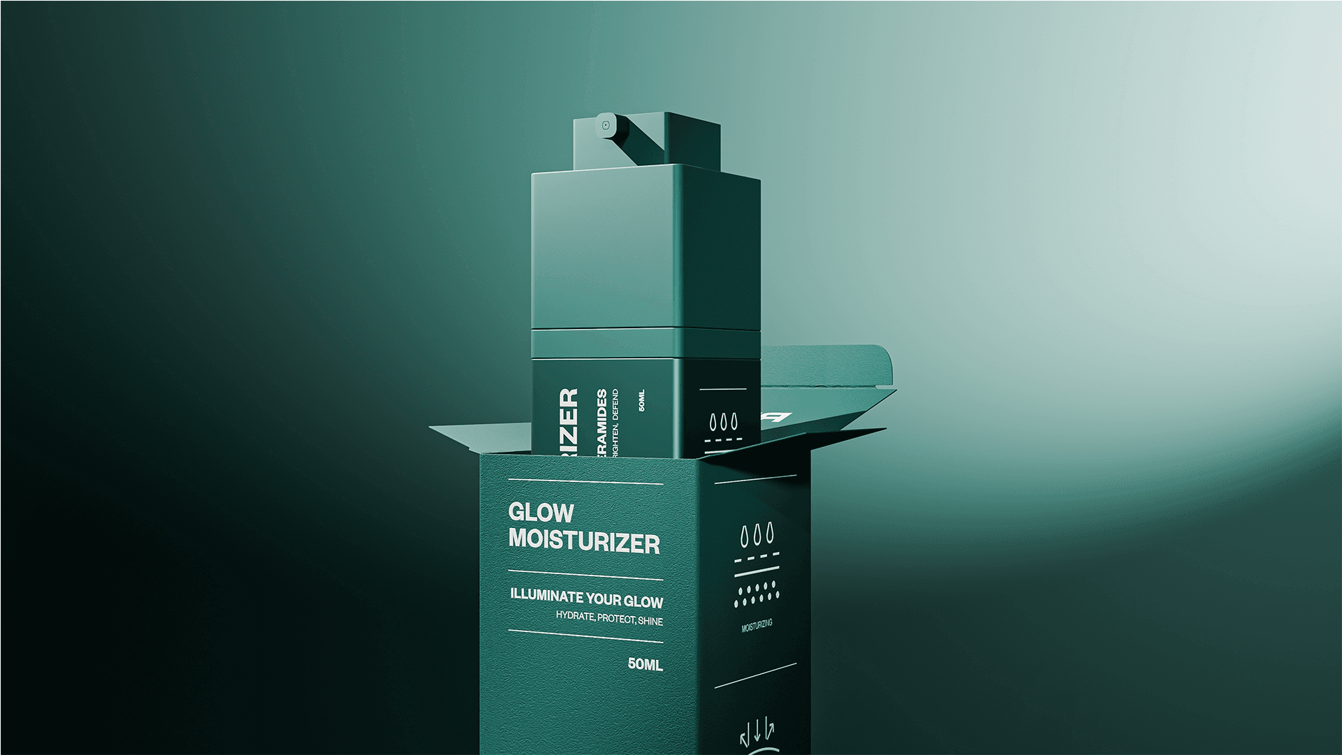
Packaging was designed to make skincare easier to understand. Instead of dense jargon and overexplained claims, the layout uses clear copy, simple icons, and strong hierarchy to help customers understand the product quickly and make the buying decision simpler.
The bottle form extended the same philosophy into physical design. Defined planes, sharp transitions, and a connected structure helped the product feel neutral, mature, and intentional — avoiding the typical soft forms often coded as either feminine or masculine.
Rendered in deep green and cream, the final identity gives Radiant Revel a serious, confident, and gender-neutral presence. It stands apart not by adding more, but by making reduction feel bold, clear, and ownable.