DECODE FINANCE
Not another blue finance brand — an aspirational identity for wealth management system

CLIENT
Decode Finance
INDUSTRY
Finance
LOCATION
USA
SERVICES
Positioning, Tone of Voice, Logo System, Colour Palette, Typography, Icons, Composition System, Animations
Decode Finance is a wealth management company using advanced AI tools and personalised strategies to help people plan around bigger, more aspirational financial goals.
The challenge was to build an identity that did not fall into the usual finance-category language — safe blues, bright greens, generic graphs, and conservative visual systems. Decode Finance was not asking people to dream safely, so the brand could not look safe either.
The core idea came from the brand’s focus on revealing investment strategies and unlocking financial knowledge. The logo became an abstract opening book, where the unfolding pages form the silhouette of the letter D. This gave the identity a symbol that felt ownable, intelligent, and directly connected to the name Decode.
The symbol was intentionally drawn with thin, refined lines to create a more premium and aspirational feel. It was paired with bold typography in an asymmetrically balanced layout, giving the identity both finesse and authority.
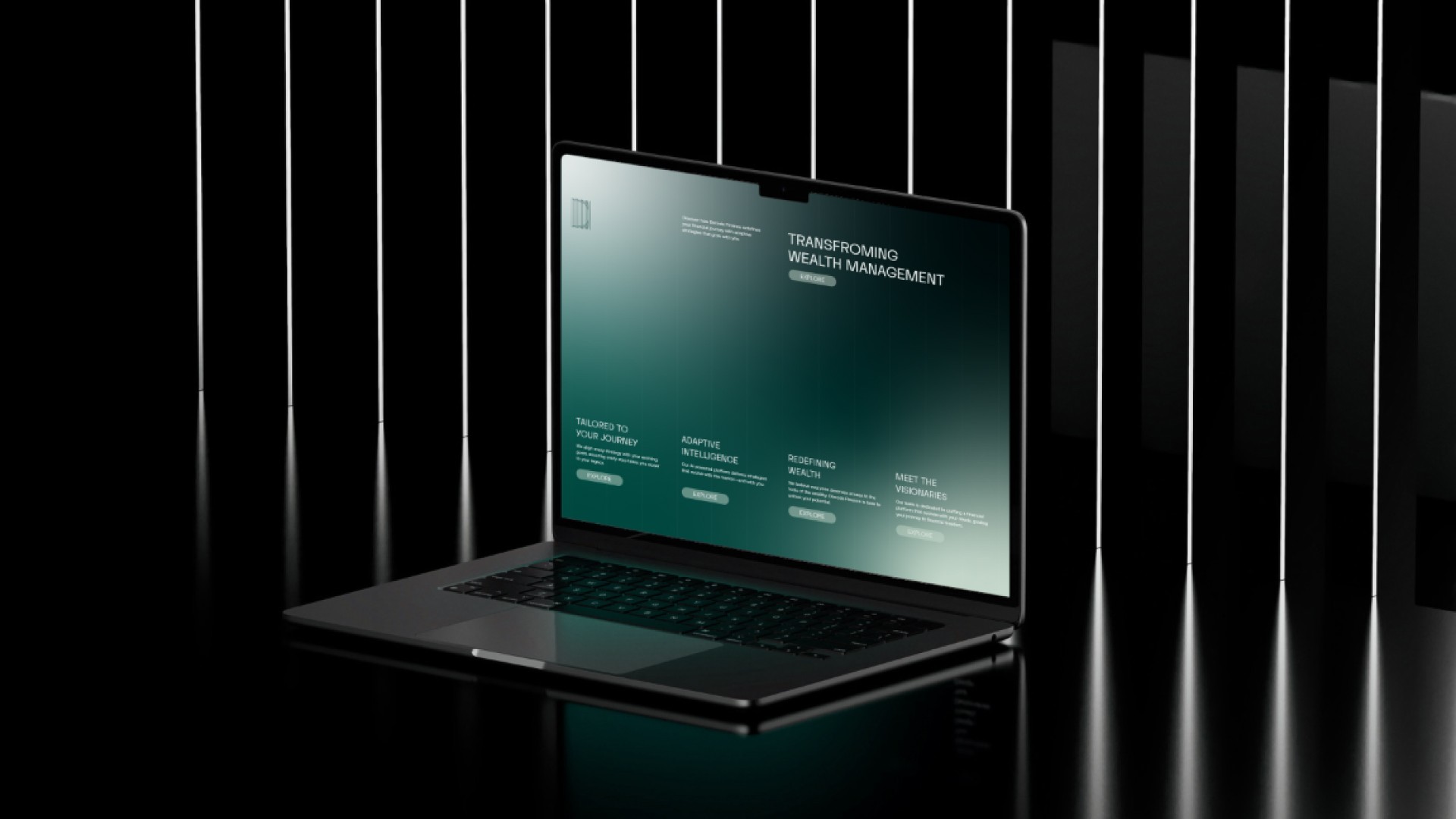
To make the identity work beyond the logo, the same vertical line language was extended into icons, graphs, animations, and the composition system. This created a unified visual language instead of a collection of generic finance assets.
The layout system was built around vertical frame divisions, making it easy for the internal team to recreate across web, social media, decks, and financial communication without breaking consistency.
Finished in a deep dark green palette, the identity helped Decode Finance stand apart from conventional finance brands while communicating ambition, intelligence, and premium wealth management.