
EDAPT
An AI SaaS identity that sold peace of mind, not another flashy technology platform.
CLIENT
Edapt
INDUSTRY
SAAS
LOCATION
USA
SERVICES
Positioning, Tone of Voice, Messaging Framework, Logo System, Icons, Colour Palette, Typography, Composition Assets, Composition System, Animations
Edapt is a SaaS platform that simplifies one of education’s most tedious tasks: compliance reporting. Its technology can turn hours of paperwork into minutes, but the brand could not behave like another loud AI tool full of flashy claims, effects, and overwhelming features.
The audience included older-generation educators and administrators who were not necessarily looking for “advanced AI.” They wanted less stress, clearer workflows, saved time, and peace of mind. So the strategy was built around restraint. Instead of selling technology, the identity focused on a lighter workday.
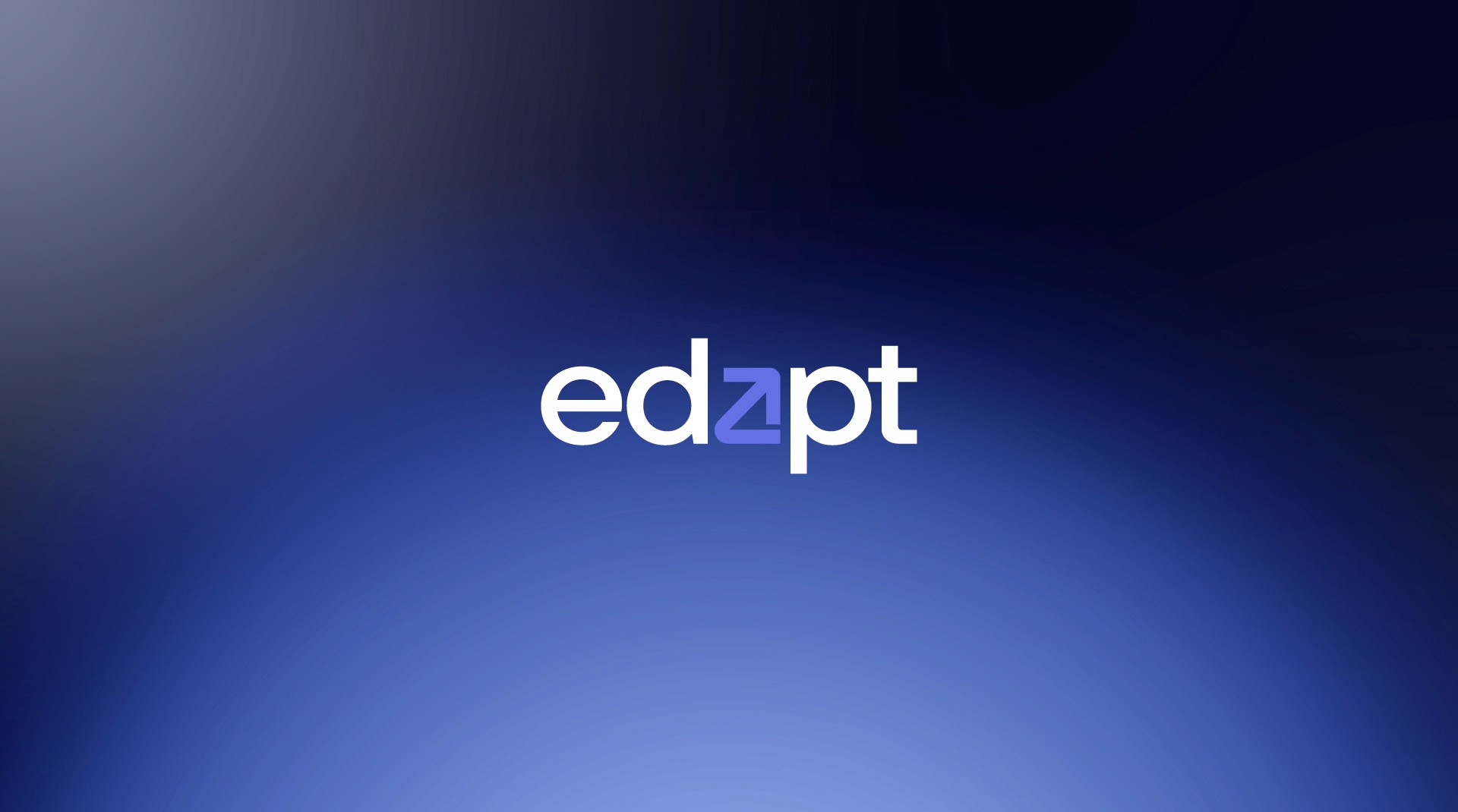
The logo uses a wordmark approach to make the short name more memorable and reduce confusion between edapt and adapt. A broad sans serif gives the identity an approachable, grounded feel, while the central a becomes an abstract arrow — a quiet symbol of progress and the relief Edapt brings into educators’ lives.
That arrow became the foundation of the wider visual system. Its construction was extended into icons, patterns, frames, composition assets, layouts, and animations, giving the brand a cohesive design language without making it visually noisy.
The colour palette uses muted blue to create trust, familiarity, and ease on the eyes, supported by vibrant accent colours to keep the identity fresh and avoid looking dated. This helped the brand feel approachable to traditional education audiences while still standing confidently beside modern AI platforms.
The final identity positions Edapt as a bridge between education and technology: simple enough for hesitant users to trust, refined enough for a SaaS platform, and human enough to make compliance reporting feel less like a burden.


