ELECXDRIP
Turning a silent letter into the most recognisable part of an urbanwear identity.

CLIENT
elecXdrip
INDUSTRY
Fashion
LOCATION
New Delhi, India
SERVICES
Messaging Tone, Logo System, Typography Scheme, Colour Scheme, Animations, Illustration Style, Garment Labels, Stationary, Packaging
elecXdrip was created as a unisex urbanwear brand inspired by street culture — its bold energy, limited drops, collaborations, and storytelling. The founder wanted to start with fashion, but eventually use the silent X as a connector for future extensions like cafés, stores, and collaborations.
The main challenge was the name itself. elecXdrip had a silent letter that needed to stay visible without being pronounced. Instead of hiding it, the identity turned the X into the central brand device.
The wordmark uses a tall, slender, confident type style suited to urban fashion. The X was redrawn as an abstract symbol — visible enough to be recognised over time, but abstract enough to stop people from reading it aloud. Its softer curves also make the sharp wordmark feel more approachable.
The brand voice was built to be direct, genuine, and inviting. Since the collections were planned as limited drops, the goal was not to speak to everyone, but to attract people who connected with the culture before they even touched the product.
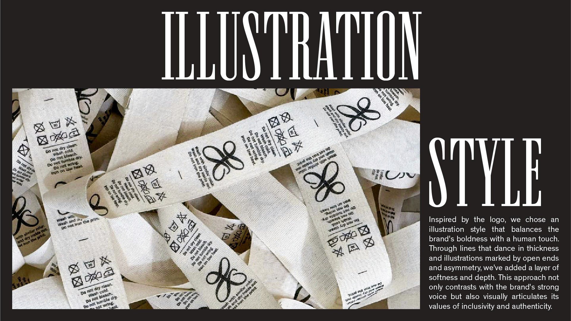
The system extended into typography, colour, animations, illustrations, garment labels, tags, stationery, stickers, bags, and packaging. The illustration style used bold variable-width lines and off-angle intersections to reflect the movement and attitude of street culture.
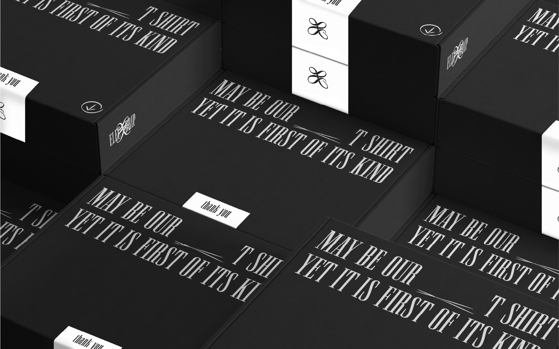
For the packaging box, we avoided the obvious logo-only approach. A simple statement was printed with a blank space for handwritten numbering, adding a small personal layer to each order and making the drop feel more limited and intentional.
The final identity made the silent X the strongest part of the brand — giving elecXdrip a bold, unorthodox, memorable system that still felt open and inviting.