HOUSE OF AZAL
A women’s ethnic wear identity built to escape the sea of floral logos and forgettable fashion marks.

CLIENT
House of Azal
INDUSTRY
Fashion
LOCATION
New Delhi, India
SERVICES
Positioning, Logo System, Typography, Custom Font, Pattern, Colour Scheme, Animations, Packaging
House of Azal was created for a women’s affordable ethnic wear brand entering a category where many labels look interchangeable — floral motifs, classic serif monograms, soft colours, and very similar marketplace presentation.
The challenge was to make the brand feel familiar enough for the ethnic wear audience, but distinctive enough to be remembered in a crowded online and offline market. The identity could not go too traditional and look dated, and it could not go too modern and lose its connection to the category.
The solution was a minimal but confident fashion identity built around an HOA wordmark, where the letter O was replaced with a dawning sun. This small custom detail gave the brand an ownable symbol, connected naturally to the name Azal, and made the wordmark more recognisable without adding unnecessary decoration.
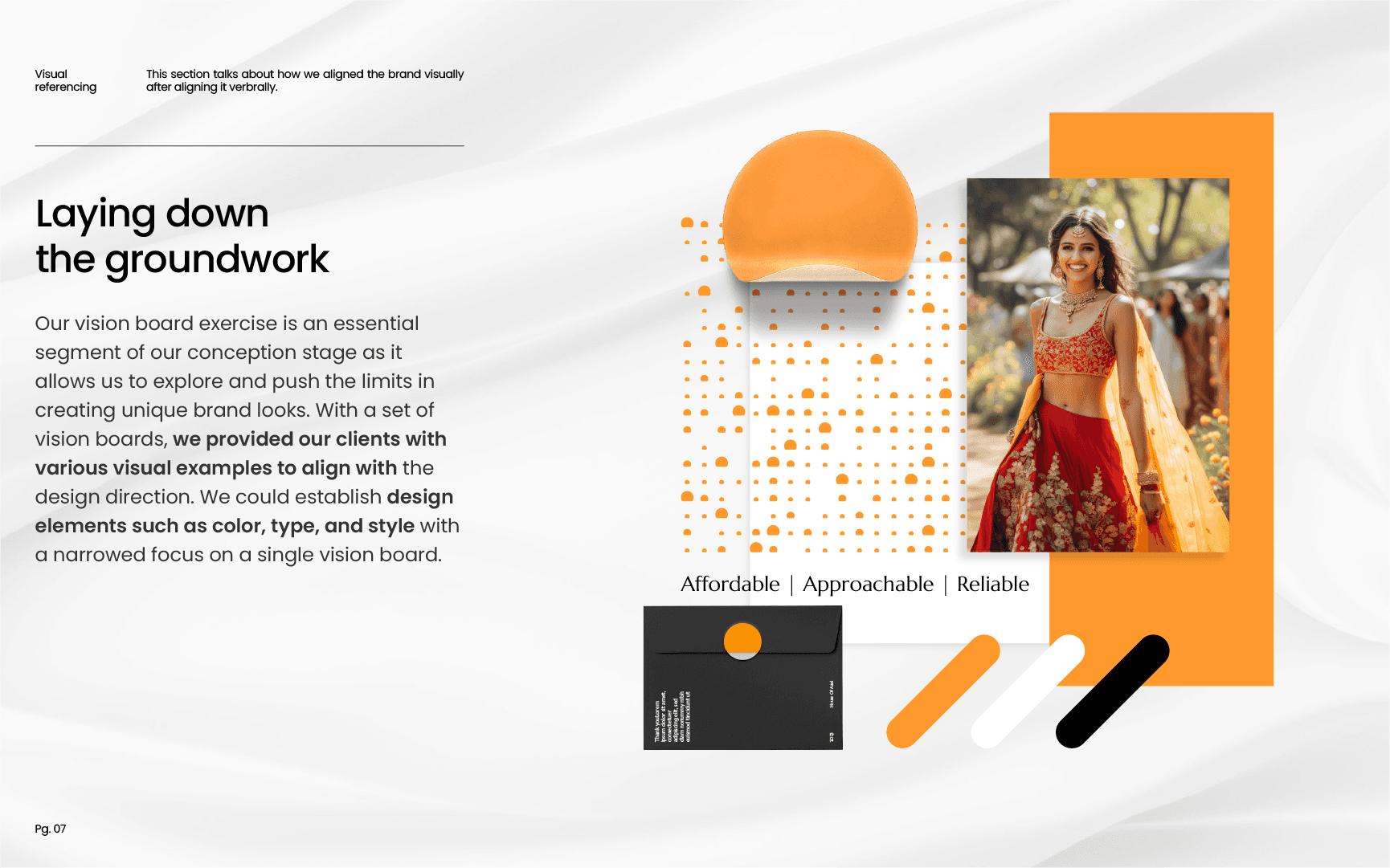
A bold orange palette was chosen to strengthen the sun concept and help the brand stand out across social media, packaging, and print. The typography system used a slender modern slab serif with customised letter details, giving the brand a fashion-led but approachable tone.
Typography played an important role in making the system feel more ownable. A modern slab serif font with strong contrast between thick and thin strokes was chosen for its confident fashion character and slender profile. The customised O from the logo was then carried into the typography system, allowing even a small letter-level customisation to build recognition across brand communication in the long run.
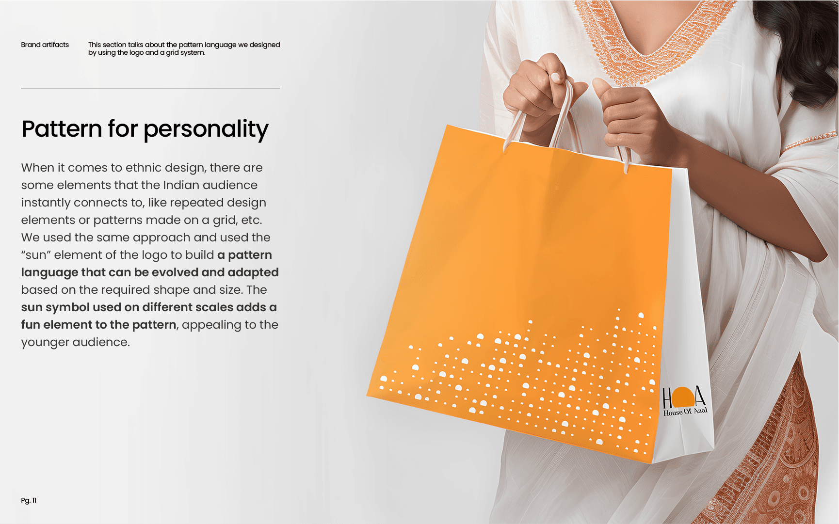
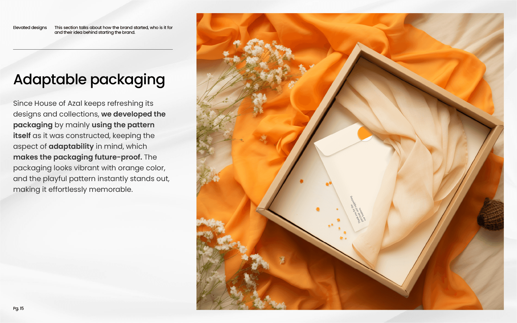
To extend the identity, a modular sun pattern was designed on a square grid. This allowed the visual language to adapt easily across packaging boxes, bags, and different print sizes while staying consistent.
The final identity gives House of Azal a clear position: modern everyday ethnic wear that feels relatable to the market, but refuses to look like every other brand in it.