LOAM
A slow-living café identity where a simple wordmark grew into a quiet visual system.

CLIENT
Loam Cafe
INDUSTRY
Cafe
LOCATION
Pune, India
SERVICES
Logo System, Colour Palette, Typography System, Icons
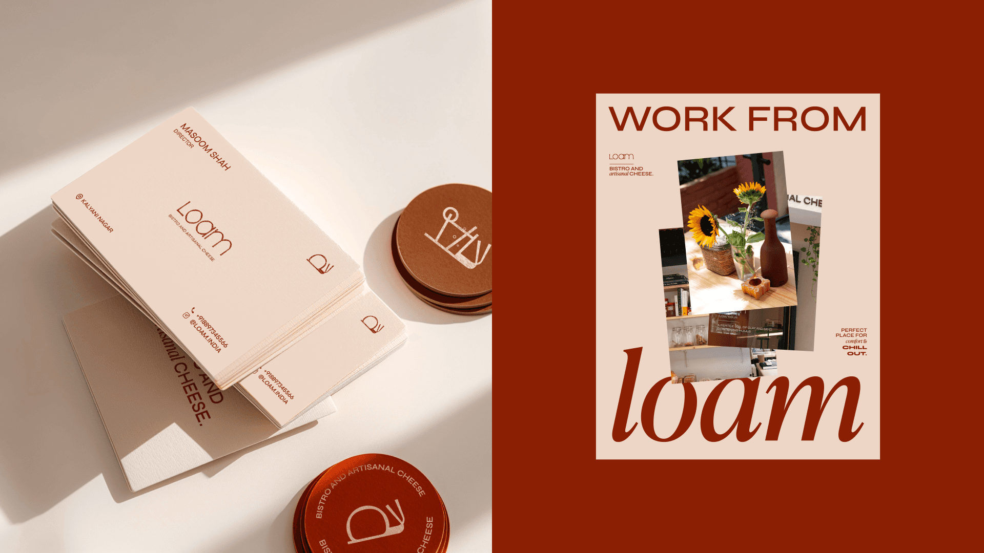
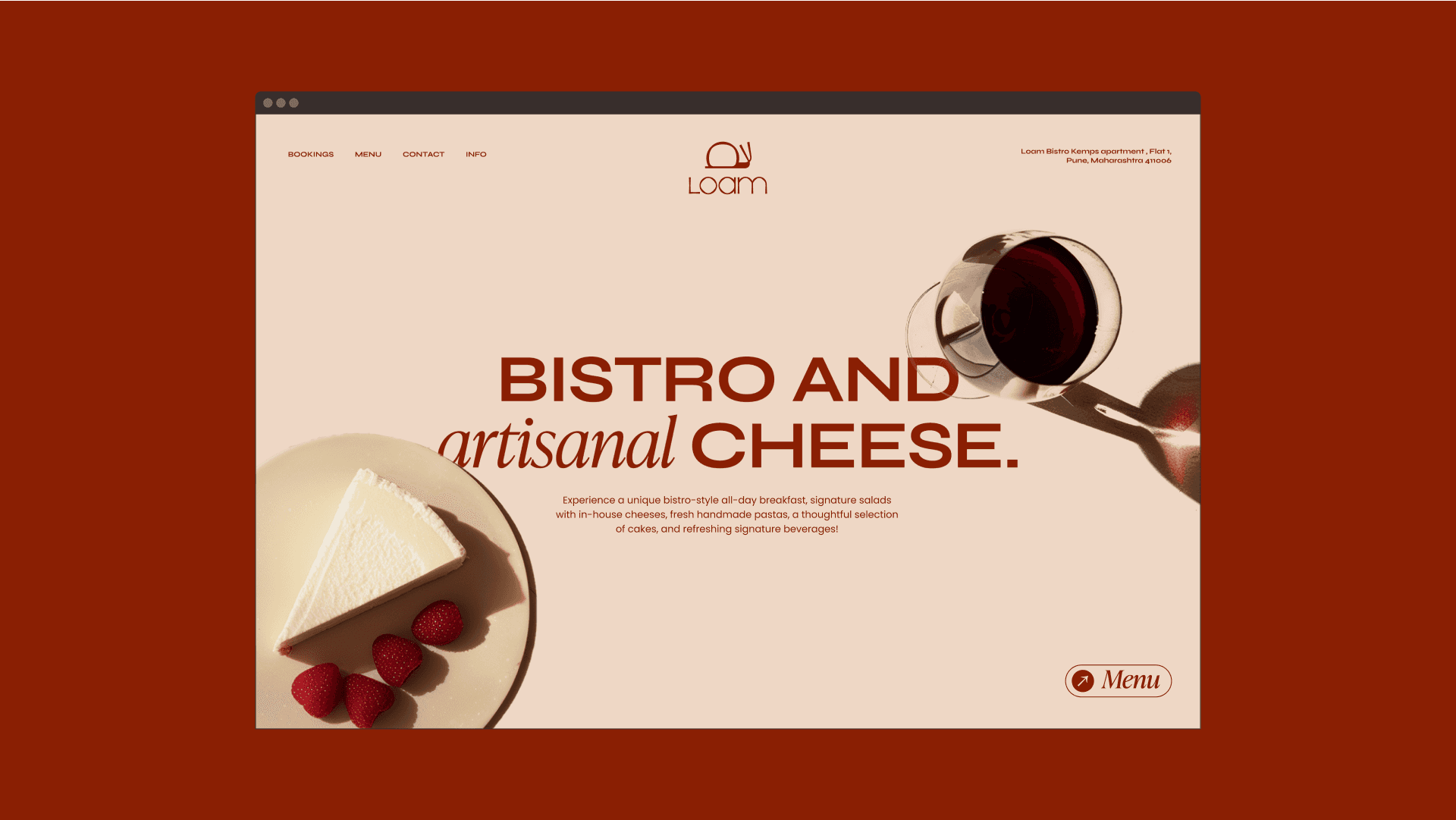
Loam was created as a café identity rooted in warmth, earthiness, and slow living. With such a short name, the identity started from a typography-first direction — a clear, simple, and memorable wordmark that could work easily across small and large applications.
The wordmark was designed to feel readable and calm, but not generic. It needed enough uniqueness to hold attention while still feeling appropriate for an artisanal premium café. The rounded structure of the letters gave the brand a softer, more grounded presence.
To extend the identity beyond type, the name Loam became the conceptual starting point. Since loam refers to rich, fertile soil, the visual language moved toward ideas of earth, pace, and quiet growth. This led to an abstract snail symbol — a subtle expression of slow living, comfort, and grounded café culture.
The snail was not treated as a mascot. It was built as a refined symbol, with the shell derived from the O in the wordmark. This connected the logo system back to the typography and made the symbol feel like a natural extension of the brand rather than a separate illustration.
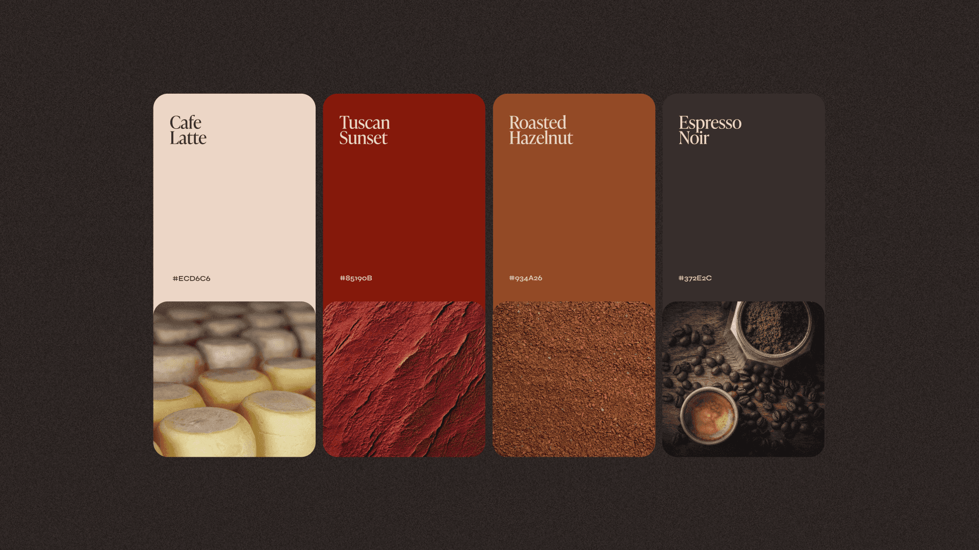
The terracotta and cream colour palette reinforced the earthy tone of the name while giving the identity warmth and a relaxed café character. For typography, both primary and secondary typefaces were kept wide, clean, and highly readable. This made the system feel breathable, slower, and easier to engage with.
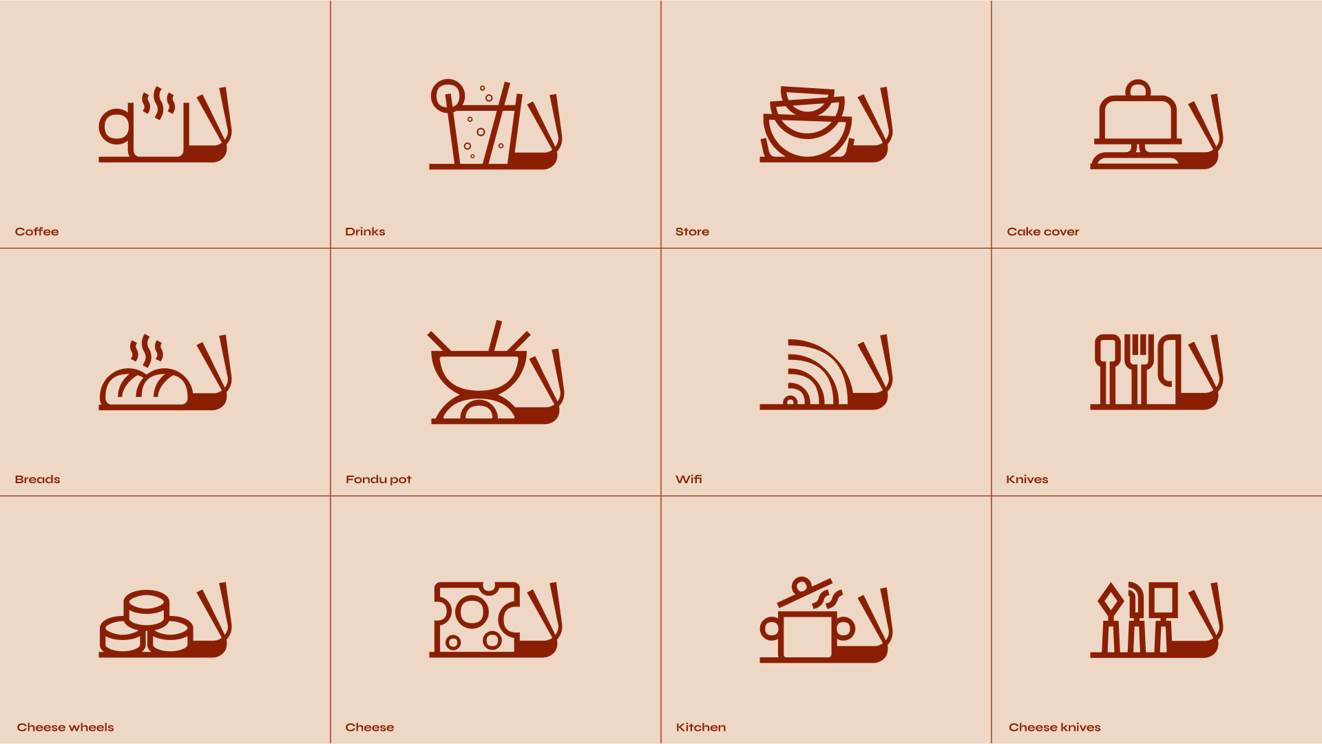
The icon system was developed from the same snail-shell logic. By modifying the shell into different variations, the identity gained a flexible set of icons while staying connected to the main logo.
The final identity gives Loam a calm and memorable café presence — simple enough to feel premium, warm enough to feel inviting, and distinctive enough to build a visual world around the idea of slowness.